
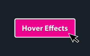
The right hover effect can really take your buttons to the next level, making them more visually appealing and more clickable.
But WordPress’s built-in button block is severely limited when it comes to hover controls. In short, there are none. Fortunately, we can create amazing, unique hover effects for WordPress buttons with a bit of CSS.
And if you’re more of a non-coder, there are several free plugins to add hover-effect buttons to WordPress without touching code.
Let’s do it.
Button Hover Effect Examples
Here’s a quick look at some of the more basic hover styles you can add to your button, using the default WordPress button block and CSS.
Hover each button to see their unique effects:
And by combining these effects together, you can achieve some pretty dramatic effects. And this is just the beginning. We’ll also look at advanced effects involving motion, shadow and more.
HTML Structure of the Button Block
We’ll be using the default Gutenberg button block for this tutorial. Here’s how they look when you dive into the HTML code on the front end:
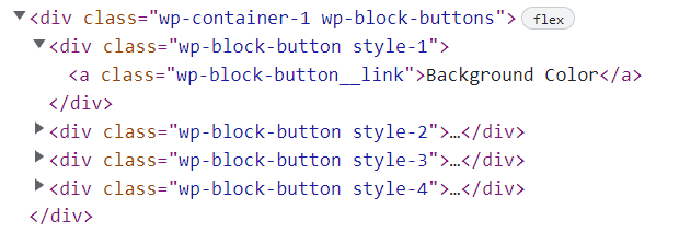
This is the HTML that’s generated by the 4 example buttons shown above. Every button block actually consists of three elements:
- Container: The outer button container wrap
.wp-block-buttonswhich contains 1 or more buttons- button wrapper: individual button container
.wp-block-button. This also where WordPress adds an custom class you assign to the button (e.g. style-1)- Button Link: The actual
<a>element which is the main button element
- Button Link: The actual
- button wrapper: individual button container
So to write our CSS we need to do two things:
- Add a CSS class to each button we want to style
- Write CSS rules targeting that unique class.
Alternatively, if you want these hover effects to apply to all buttons, you don’t need a custom class.
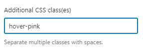
How to add a custom Class
When editing a button in the Gutenber editor, click inside the button and look for the block settings sidebar on the right-hand side.
Then expand the ‘advanced’ dropdown, and look for the field labelled Additional CSS classes.
Here you can add any number of custom class names, separated by a space.
It’s a good idea to use a descriptive class name that describes either the button style you’re creating or the hover effect you want to apply.
For example, if you were creating a button that turns pink on hover, you might use the ‘hover-pink’ class.
This class will then appear in the front-end code. Like this:
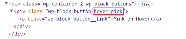
That’s everything we need to target our CSS styles to the button.
Which CSS Properties to Change on Hover
There’s a ton of room for creativity when it comes to button hover effects, but these are some of the most popular properties to change on hover:
- Color: The text color of the button
- Font-weight: How heavy (thick) the button text is
- Background-color: button background color
- Background: non-solid backgrounds like gradients and images
- Border: Width, style and color of the button border
- Box-shadow: Drop-shadow effect around the button that gives is virtual lift off the page
- Transform: You can use this to resize (scale), move (translate), distort (skew) or rotate the button.
Overriding Inline CSS with !important
If you use Gutenberg’s built-in button styling options (background color, text color, etc) this will add inline CSS to the front-end HTML.
The only way to override this with CSS is to add !Important to the end of your rules targeting the hover state. As such, we’ve added !important to all CSS rules shown below.
Note: This is not necessary (or recommended) if you won’t be using Gutenberg’s styling controls.
Animating Hover effects
CSS has a built-in animation property that will gradually transition between the normal and hover states of elements, using a delay that you specify.
This is known as the transition property, and it’s quite easy to set.
I recommend applying a default transition to all your buttons, which you can then override on a per-button basis if needed.
Here’s a basic rule with a transition duration of 0.2s, which will apply to all animatable properties.
.wp-block-button a.wp-block-button__link {
    transition: all .2s;
}Code language: CSS (css)
Hover Effect Styles
Here’s a bunch of different hover styles you can use, with examples. You simply copy the code as written and just add the same class name to your button if you want.
Button Text
You can change the color and/or font-weight of the button text on hover. Here’s an example of each:
.change-text-color a.wp-block-button__link:hover {
    color: black !important;
}

.bold-on-hover a.wp-block-button__link:hover {
    font-weight: 700 !important;
}Code language: CSS (css)
Background color
This rule will change the button background-color on hover. You can swap out your own hex color code to fit your color scheme.
.hover-background-color-1 a.wp-block-button__link:hover {
    background-color: gold !important;
}

.hover-background-color-2 a.wp-block-button__link:hover {
    background-color: #00539B !important;
}Code language: CSS (css)
Background (gradients)
Gradients are a great way to spice up your buttons and give them a really unique look. That said, it’s easy to overdue it. Subtle gradients (slight color changes) often look better than large ones.
There are two types of CSS gradient, linear and radial. You can fine-tune each, using multiple colors and even controlling the width of each color band.
If you’re new to CSS gradients, I recommend using a free CSS gradient generator which will let you visually design the perfect gradient. Then just copy the CSS to your site.
CSS Gradients the easy way: CSS Gradient Generator
.linear-gradient-hover a.wp-block-button__link:hover {
    background: linear-gradient(57deg, #8826c9, #f945ff) !important;
}

.radial-gradient-hover a.wp-block-button__link:hover {
    background: radial-gradient(gold, #ff9100, #fc6262) !important;
}Code language: CSS (css)
Borders
Changing button borders on hover can be tricky because it may change the physical size of the button, making the surrounding content shift.
You can avoid this by either:
- making sure the border-width is the same between hover and non-hover states
- Adjusting the button height/padding to compensate for the border change
If you don’t want a visual border, you can still use method #1 by making the border-color transparent when you don’t want it visible.
.grow-on-hover a.wp-block-button__link:hover {
    transform: scale(1.05);
}

.shrink-on-hover a.wp-block-button__link:hover {
    transform: scale(.95);
}Code language: CSS (css)
Size
You can change the button size on hover using the Scale Transform property. It’s easy to make your buttons grow or shrink on hover. It’s a good idea to combine this with a transition period to animate the hover effect over 1/4 second or so.
Position
You can also use the transform property to translate (move) the button on its X (horizontal) and/or Y (vertical) axis.
.move-up a.wp-block-button__link:hover {
    transform: translateY(-2px);
}

.move-down a.wp-block-button__link:hover {
    transform: translateY(2px);
}Code language: CSS (css)
Depth / Shadow
You can use box shadow to give a sense of three dimensional depth. The further the shadow spreads, the higher off the page your button will appear.
You can even combine it with the transform property to make it even more realistic.
Here’s an example:
.lift-on-hover a.wp-block-button__link {
    box-shadow: 0 2px 2px rgb(0,0,0,.15);
}

.lift-on-hover a.wp-block-button__link:hover {
    box-shadow: 0 3px 10px rgb(0,0,0,.35);
    transform: translateY(-1px);
}Code language: CSS (css)
Using a Plugin to add button hover effects (no CSS)
Let’s face it, CSS isn’t for everyone. It’s can be confusing when you’re first getting started and some people would prefer never to touch CSS in WordPress.
The great thing about WordPress is there’s almost always a plugin solution to avoid coding it yourself.
These are the best free plugins to add custom button and hover effects to your website:
1. Max Buttons
MaxButtons is the most popular WordPress button plugin, and it works with both Gutenberg and the classic editor.
The free version is pretty basic, and lets you customize background color, size, border and add an icon. You can upgrade to MaxButtons Pro for even more controls and hover effects, or buy professionally designed button packs for some truly unique looks.
2. Kadence Blocks
Kadence Blocks a high quality, free Gutenberg block addon which comes with an ‘Advanced Button’ block.
The Kadence button builder lets you customize colors, borders, padding and add icons. You can also arrange your buttons inline for a ‘dual button’ look.
Kadence buttons have even more settings too, if you want them. You also get:
- Padding (inside space)
- Margin (outside space)
- Box-Shadow
- Gradient Backgrounds
- Hover Color
- Border Color
- Border Width
Summary & Next Steps
Currently, WordPress core doesn’t let you set a hover color for your Gutenberg Buttons. Until that option becomes available (it probably will), you’re stuck using 3rd-party plugins or custom code.
With a little bit of CSS (examples above) you can easily create custom button styles and hover effects for your site.
Non-Coders may prefer to rely on plugins such as Kadence Blocks, MaxButtons, Stackable, or other Gutenberg Addon packs.
Here are some more resources for adding awesome hovers: