
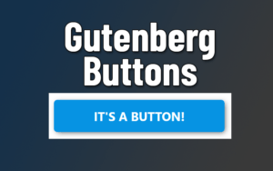
Do you want stylish, reusable buttons without buying yet another plugin? It’s actually really easy to build unique button styles with the Gutenberg Button Block.
The default styling options for Gutenberg buttons are a big upgrade from the old WYSIWYG/Text-editor. For example, you can set the text, background and hover colors (and even add gradient backgrounds!).
But in the end, these tweaks can only get you so far. Your buttons will still look ‘Standard’. Not unique in any meaningful way.
That’s not good enough for me, and since you’re here it’s clear you’re better than ‘standard’ too.
How we can customize Gutenberg Buttons
To go beyond the standard styling options, we’ll need some CSS. Don’t worry, I’ve already written the code for you, and you can tweak it to add some original flair.
My Approach: I created custom CSS rules that for specific classes that can be assigned to a button in the editor. You can add multiple classes to a button to combine these styles for some truly unique CTA’s and buttons.
How to add a custom class to buttons?
Every Gutenberg block has an ‘advanced’ section under the block settings. Here’ you can add one (or more) class names to markup the HTML code on the front end.
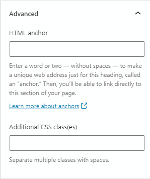
What’s the point of adding a class? This makes it possible to target the button with customized CSS rules. For example a ‘shadow’ class might add box-shadow to your button.
Setting default button styles
You may want to tweak the ‘default’ button styles, so that even your basic buttons match your theme and taste without any additional styling.
For example, the there’s is minimal padding and no minimum-width specified by default, which make buttons with short text look unbalanced.
Default Gutenberg button (zero styling):
What to style?
You may only want to add rules that affect things like shape and function, rather than color (which can easily be adjusted in the button block settings).
Ideas for default styles:
- Min-width: Set a minimum width to avoid wimpy buttons (see above)
- Border-radius: Do you want rounded or rectangular buttons?
- Font: Set your default button font, font-size and font-weight.
- Margin: set a minimum spacing from other elements
For example, here’s some default styles and the resulting button:
.wp-block-button a {

   min-width: 250px;
   border-radius: 5px;
   font-weight: bold;
   border-bottom: 0;
   margin: 20px auto; /* Top & Bottom margin = 20px, L&R is auto */
   color: white; /* prevent theme css from overriding color */
}

/* prevent your theme 'link' settings from overriding button text color */

.wp-block-button a:hover {

    color: white;

}
Code language: CSS (css)And then you can easily use the block settings to add things like background color to your button, but keep the default styles:
Gutenberg Button Examples (with CSS Code)
Now that you have the basics down, we can create some more interesting styles for our buttons.
Button w/ Box Shadow
Class to add: .box-shadow
.wp-block-button.box-shadow a {

    -webkit-box-shadow: 2px 2px 8px -2px rgb(31 31 31 / .8);
    box-shadow: 2px 2px 8px -2px rgb(31 31 31 / .8);
}

.wp-block-button.box-shadow a:hover {

    -webkit-box-shadow: 2px 2px 10px 0px rgb(31 31 31 / .6);
    box-shadow: 2px 2px 10px 0px rgb(31 31 31 / .6);
}Code language: CSS (css)Wide Button
Class to add: .wide-button
.wp-block-button.wide-button a {

    width: 100%;
    margin: 30px 20px;
    max-width: 500px;
    font-size: 25px;
}

.wp-block-button.wide-button {
    width: 100%;
    text-align: center;
}Code language: CSS (css)Button With Icon & hover animation
Classes to add: .icon-button + .left (optional. Moves icon to the left side)
Note: This CSS requires you to have FontAwesome installed on your site, and active on the page. I’m using FontAwesome v5, but it can be adapted to other verions.
How to use: If you add the .icon-button class (required), the icon will be on the right side. If you add both .icon-button and .left to the button classes, the icon will be on the left.
Shown below: Default button (left) and button with blue-gradient
.wp-block-button.icon-button a {
    padding-left: 15px;
    padding-right: 15px;

}
.wp-block-button.icon-button a:after, .wp-block-button.icon-button a:before {

    font-family: "Font Awesome 5 Free";
    font-weight: 900;
    position: relative;
    transition: all .1s;
}

.wp-block-button.icon-button:not(.left) a:after {

    content: "\f138";
    right: -10px;
}


.wp-block-button.icon-button.left a:before {
    content: "\f138";
    left: -10px;
}

.wp-block-button.icon-button a:hover:after {
    right: -15px;
}

.wp-block-button.icon-button a:hover:before {
    left: -15px;
}Code language: CSS (css)
3D Effect Button
Class to add: .three-dee
Here’s a 3D button with hover effect. You can see it pictured with the default style, or with a gradient added in the block settings.
.wp-block-button.three-dee a {

    box-shadow: 2px 2px 0 2px #5f5f5f;
}
.wp-block-button.three-dee:hover a {

    box-shadow: 1px 2px 0 0px grey;
    transition: all .1s;
    transform: translate(2px, 2px);
}Code language: CSS (css)
Button Hover Effects
These are classes you can add to any button, to give them a neat hover effect.
Change the background color automatically
One of the giant missing feature from the button block is the ability to set a hover color for your buttons. At the very least, the predefined styles should have a default hover effect. But they don’t.
You can, of course, define a :hover color for each default button color, but wouldn’t it be easier to automatically change the background regardless of what color the button is?
You can. With the magic of CSS filters.
Class to add: .color-shift (or put this in your default button styles)
This to know:
- Issues: It doesn’t work on black or dark-gray buttons
- Adjust color: tweak the hue-rotate parameter (maximum 360deg) to adjust the amount of the color shift
- Adjust saturation: Change the saturation percentage to change whether the color is over-saturated or under-saturated.
Example buttons:
.wp-block-button.color-shift a:hover {

    filter: hue-rotate(25deg) saturate(1.5);

}Code language: CSS (css)
Enlarge on hover
Class to add: .hover-enlarge
.wp-block-button.hover-enlarge a {
    transition: transform .2s ease-in-out;
}

.wp-block-button.hover-enlarge a:hover {
    transform: scale(1.04);
}Code language: CSS (css)
Underline on Hover
This is a cool animated underline effect using the :after pseudo-element. You may need to adjust the bottom property depending on the amount of padding you use for your buttons.
Class to add: .hover-underline
.hover-underline a {
    position: relative;
  /* required to position :after pseudo element */
}

.wp-block-button.hover-underline a:after {
    content: "";
    width: 0%;
    height: 2px;
    background-color: #ffffff;
    position: absolute;
    bottom: 10px;
    left: 50%;
    right: 50%;
    transition: all .2s;
}

.wp-block-button.hover-underline a:hover:after {
    left: 25%;
    width: 50%;
}Code language: CSS (css)
Summary
As you can see, there’s a ton you can do with the Gutenberg button block. You just need to a bit of CSS code.
Hopefully a future WP update will add the ability to choose a custom hover color for your buttons.
Until then, you can set a default hover color, or use one of the other hover effects like:
- shadow
- underline
- enlarge
- etc…
Did you create your own custom button styles for Gutenberg? Share your CSS in the comments for everyone to try and enjoy.