
There are several different ways you can add a sticky header or navigation menu to Generatepress theme. The best method will depend on exactly which element you want to make sticky, and whether or not you’re using Generatepress pro.
The paid version of Generatepress does include a ‘sticky navigation’ module which does allow you to make any nav menu sticky with a single click. The free version of GeneratePress doesn’t include this feature, so you’ll need to use one of the other options below.
Methods to add a sticky header in GeneratePress:
- Use the ‘Sticky Navigation’ module of Generatepress Premium
- Use the sticky anything plugin
- Make a sticky header with pure CSS
Video Tutorial:
Add Sticky Navigation with GP Premium
This is the easiest option, and it’s built into the theme functions meaning it’s optimized for Generatepress, and should work flawlessly, without slowing down your site. This option isn’t available in the free version, so you’ll need to upgrade. Premium is well-worth the price in my opinion.
Note: This is a sticky Navigation module, not a true sticky header. You have the option to add a logo to the navbar, but it’s still just for sticking menus. It’s not a true header.
Here are the steps to set it up:
1. Enable the Menu Plus module
In your WordPress dashboard, go to Appearance > Generatepress and make sure the Menu Plus module is activated. This is required to add the sticky navigation option to the customizer.
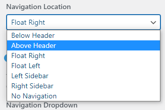
2. Set the primary nav location
To enable sticky nav, you have to set the navigation location to either above the header or below the header.
You can change this setting under: Customizer > Layout > Primary Navigation > Navigation Location
3. Enable Sticky Navigation
Go to Customizer > Layout > Sticky Navigation
Then turn sticky navigation On. You can also set it to desktop-only or mobile-only if you want.
Transition: You can also set the transition animation, choosing between: Slide, Fade or None. I prefer Slide.
Hide when scrolling down: Enable this option to only sticky the navbar when your visitor scrolls up. It saves valuable screen real estate (I enabled the option on this site).
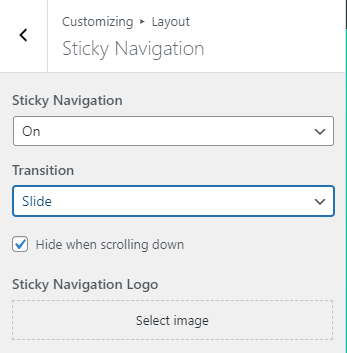
Sticky Navigation Logo: You can set a unique logo just for the sticky navbar. It can be a different size than your main header logo, or a different image entirely (like a more compact version of your logo). If you don’t specify a logo, it won’t show one (unless you choose to use the sticky nav as the header (below).
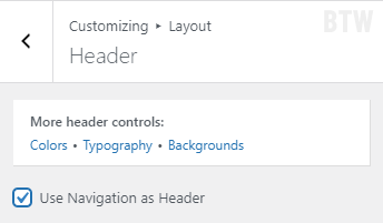
4. Use Sticky Navigation as Header (optional)
Instead of having a separate header and menu bar, you can combine them and use the sticky nav as the header. This will automatically pull your header logo and site title into the navbar.
To enable this option go to:
Customizer > Layout > Primary Navigation > Use Navigation as Header
Use a Plugin to Add Sticky Nav/Header
Using a plugin is the most popular way to add a sticky header if it’s not built into your theme. That’s because it requires zero coding or CSS, and it only takes a minute to setup.
Unfortunately, the most popular sticky menu plugins in the WordPress repository removed a bunch of features in order to upsell to the pro version. Still, we can get everything we need from the free version.
Best Plugins to add a sticky Header or Menu:
Both will work, but I prefer MyStickyMenu because it has a few more options available in the free version. The setup process is straightforward. Follow the steps below or watch these video instructions.
Make sticky header with MyStickyMenu
1. Install & Activate the plugin
Install the free version directly from the official repository and activate it.
2. Select the Element to Target
You need to know the ID or class-name of the element you want to make sticky. Here are the relevant classes and ID’s for Generatepress (you can use either)
Header: #masthead (ID), .site-header (class)
Primary Menu: #site-navigation (ID), .main-navigation (class)
Then you just need to enter the CSS selector (ID or class) in the plugin settings:
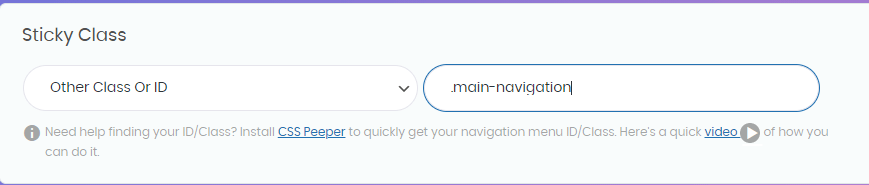
The plugin actually automatically detected the .main-navigation class on GeneratePress. But you can easily target the header instead. Just add #masthead to the settings instead of .main-navigation to make the header sticky.
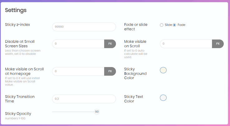
3. Configure additional settings
The reason I prefer this plugin over the other is that you get way more control over the behavior of the sticky element, including the ability to disable it on smaller screens, set a background color, and add a transition effect.
- Z-index: Set the stacking order to make sure the element is drawn above the rest of your site when sticky. The default is 9990, and can usually be left as-is.
- Fade or Slide: Choose the animation effect when the element becomes sticky
- Disable on small screen sizes: Choose a screen width (in pixels) below which the element won’t be sticky. On GeneratePress, 768px is a default breakpoint and good option.
- Sticky Background Color: Change the background color when sticky.
- Sticky Transition Time: How long the transition animation (fade/slide) lasts.
- Sticky Opacity: Element opacity when sticky. Less than 100 makes it partially transparent.
GeneratePress Sticky Menu w/ CSS
You don’t need a fancy plugin to create your sticky navigation. All it takes few lines of CSS code, thanks to the new Position: Sticky property. Zero JavaScript required.
First, you’ll need a classname or ID of the Element you want to target. Here are the defaults for GeneratePress:
- Header: #masthead (ID), .site-header (classname)
- Primary Nav: #site-navigation (ID), .main-navigation (classname)
Note, the ID’s are preceded with the # and the classes with a period . . That’s what you’ll want to use in your CSS code as well.
Where to put the CSS?
WordPress now has an ‘additional CSS’ section of the customizer where you can easily add the code. Other alternatives include the Simple CSS (also by the author of GeneratePress) or you can stick it directly in your Child Theme’s style.css file.
Good CSS locations:
- Additional CSS: (WordPress customizer)
- Plugin: (e.g. SimpleCSS)
- Child Theme’s: style.css file
Here’s example CSS code to use:
This code will stick the site header. There’s also an included offset for the admin bar when logged-in.
/* This code makes the GeneratePress header sticky. */

.site-header {
    position: sticky;        /*make it stick */
    top: 0;                      /* stick it to the top of the window */
    z-index: 999;           /* draw it over other elements */
}

.admin-bar .site-header {
    top: 32px;     /* fix the offset for admin bar when logged in */
}Code language: CSS (css)
Here’s the CSS for sticking the primary menu:
/* This code makes the GeneratePress Menu sticky. */

.main-navigation {
    position: sticky;        /*make it stick */
    top: 0;                      /* stick it to the top of the window */
    z-index: 999;           /* draw it over other elements */
}

.admin-bar .main-navigation {
    top: 32px;     /* fix the offset for admin bar when logged in */
}Code language: CSS (css)
Disable ‘Stickiness’ on certain screen sizes
It’s pretty common to use sticky navigation only on certain device types. Maybe you want it only on mobile browsers. Maybe only desktop.
To do that, we can wrap the above code in a Media Query, to make sure it only gets applied when the screen width matches our rules. We’ll use GeneratePress’s default breakpoint of 768px for this example, but you can change it to whatever you want.
To make it sticky only on small screens:
/* Make header sticky <em>only</em> on small screens (less than 768px) */

@media screen and (max-width: 768px) {

    /* This code makes the GeneratePress Menu sticky. */

    .main-navigation {
        position: sticky;        /*make it stick */
        top: 0;                      /* stick it to the top of the window */
        z-index: 999;           /* draw it over other elements */
    }

    .admin-bar .main-navigation {
        top: 32px;     /* fix the offset for admin bar when logged in */
    }

}Code language: CSS (css)
And to make the header sticky only on larger screens, all you have to do is change the media query from max-width to min-width. To see it in action, watch this video demonstration.
Which method is best?
Usually, I just go with the GeneratePress built-in sticky functionality. I haven’t built a site yet where I found it too restrictive. That said, if you haven’t upgrade to Generatepress premium yet (just do it), you’ll probably need to use one of the other two options.
Of the two, a plugin will be the best option for most users, because it’ll add browser fallbacks and a transition animation that you won’t get from this simple CSS solution.
On the other hand, the CSS method is incredibly lightweight and will have near-zero impact on your site speed or page load times. If you just need basic sticky functionality, it’s a great option.
Summary
There are good methods to add make a sticky element on your GeneratePress site, including sticky headers or a sticky menu.
The methods are:
- Sticky-nav Module of GP Premium
- 3rd-party Plugins
- Custom CSS using
position: sticky;
My preferred solution is to use the built-in sticky-nav feature of GP Premium. It cross-browser support, full theme integration, and nice transition animations.
And because you can make the menu sticky itself turn it into a header replacement (use sticky nav as header) it’s flexible enough for most use-cases.
There are also two excellent (but limited) free plugins you can use. Of the two, I prefer MyStickyMenu which has more functionality in the free version than the other alternatives.
And if you’re the DIY type (or you love lightweight code) go with the simple CSS option using Position: sticky;
Thanks! This was very helpful. I went with the CSS code and that works for me!
Awesome! Yeah the CSS method is so simple and is good enough for most sites.
Hello again Matthew,
I tested using the min-max media query (which did work to disable the sticky header on mobile phone). But the problem is that it only works in portrait mode. When I turn my phone to landscape position it just goes back to sticky again. Is there something else I need to add??
Also, another alternative I’d like to really try is keeping the sticky header in all cases, but in mobile landscape mode reducing the height of the sticky header so that it won’t cover up so much of the content. Is there a way to do that? Ideally, that’s what I think I’d rather have.
For the media query, you just need to change the value in the (max-width: ???px) to be larger, so the rule still applies to phone screens in landscape mode. So if you currently have it set to max-width: 400px, try raising it to 768px (a default GeneratePress breakpoint also).
You can also use the media query to adjust the spacing/height of the menu. I recommend using chrome devtools to find the right classes to target, but if you’re using Generatepress then the menu height is generally cause by:
So for example inside your media query if you’re using generatepress you could try something like:
.main-nav .menu-item > a {line-height: normal;}Then, if your logo is still making it too tall, try resizing the logo like
.site-logo .header-image {max-width: 70%;}(tweak that value as needed)All these rules should go inside your media query. If you’re using GeneratePress PRO it’s a lot easier, you can just use the built-in sticky nav function and you can adjust the sticky navigation styles separately in the customizer.