
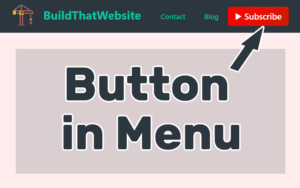
Adding a button to your menu in WordPress is actually pretty simple. It doesn’t require adding a plugin or a special theme. All we need is a little bit of CSS code, and a built-in (but hidden) feature of WordPress’s menu system.
Here’s what we’re going to do:
- Add a CSS class to our menu item
- Style that menu item to look like a button
- Celebrate! 🥳
And don’t worry, you don’t need to know how to write CSS code. I’m going to write it for you.
1. Add a CSS class to your menu item
In order to accurately target our CSS rule to the right menu item, we need to add a CSS class to it. This is a simple identifier which WordPress will add to the HTML code, allowing us to laser-target the rule.
Technically, you can use the randomly generated CSS ID that WordPress assigns to each menu item, but this method is cleaner and makes the code easier to reuse.
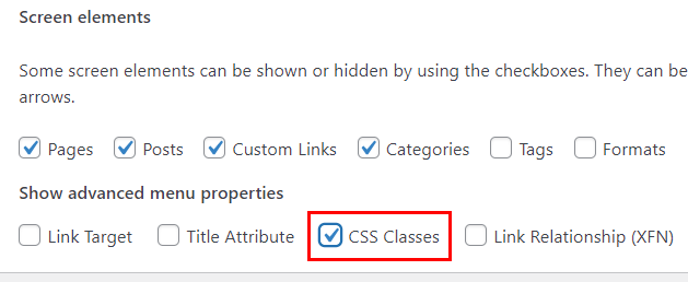
By default, the ability to add CSS classes to menu items is hidden in WordPress. So we need to enable it.
To Enable CSS Classes for WordPress Menus
- Go to Appearance > Menus from the dashboard or customizer
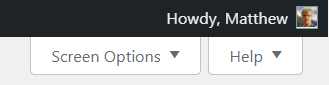
- Click the ‘Screen Options’ toggle in the top-right corner
- Make sure CSS Classes is enabled.
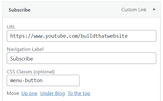
Create a menu item and add CSS class
- Go to Appearance > Menus from the dashboard
- Create new ‘Custom Link’ to and add it to the menu
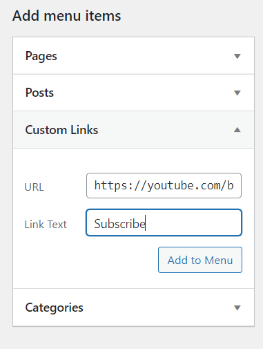
- Expand the new menu item in the Menu Structure view
- Add a unique custom CSS class name (for this example, I’ll use menu-button but you can choose anything).
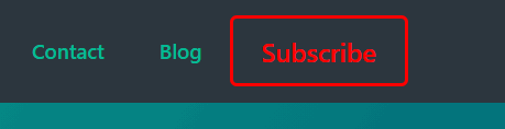
Now save the menu and make sure it’s set to display. Then, on the front end of the site you’ll see the new menu item has been added.

Now that you’ve completed this step the basic HTML structure for our button is in place. We just need to add the CSS styling to bring it to life.
2. Styling the Menu Button w/ CSS
We can use a few lines of CSS to transform a simple menu link into a button. You can adapt these styles for your own needs. The most common values to tweak will be the colors and padding.
We’ll design two basic button styles:
- Solid button with hover effect
- Outline (ghost) button that fills on hover
And then I’ll show you a couple simple upgrades you can add (like icons and gradients) for even cooler button designs.
Where to put the CSS: Your menu is viewable across your entire site, so the best place to put the CSS code is in your theme, a CSS plugin, or the ‘additional CSS’ section of the WordPress Customizer.
Outline Button (ghost button)
This simple button uses a colored border and matching text color to create an ‘outline’ effect. On hover, the button fills with the border color, and uses CSS transitions to animate it smoothly.
How to use: Substitute your own colors, and change the padding to adjust the button size to fit your menu.
.menu-button a {
border: 3px solid red; /* button border width and color */
color: red; /* text color */
line-height: initial; /* reset the line-height. Let padding control size */
padding: 10px 20px;
border-radius: 5px;
font-size: 19px; /* Optional. Remove to match to your other menu items */
transition: all .25s; /* animate the hover transition. Duration 0.25 seconds */
}
.menu-button a:hover {
color: white; /* change the hover text color */
background-color: red; /* fill the background on hover */
}
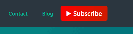
Code language: CSS (css)Solid Button (with optional upgrades)
For this style we’re using a solid-filled background color. For fun, I’ve added a Unicode icon and a gradient for the background. You could easily substitute an Emoji or something like a FontAwesome icon.
Hover effect: The background color changes on hover, and you can also enlarge the button (optional). It’s all animated with the CSS transition property.
/* don't forget to add the CSS ID of your menu in front of these rules (see above) */

.menu-button a {
	background-color: red;
	border-radius: 5px;
	color: white;
	font-size: 18px;
	line-height: initial;
	padding: 8px 15px;
	position: relative;
	transition: all .25s;
	}

.menu-button a:hover {
       background-color: #e20707   /* slightly darken the button */
}
Code language: CSS (css)
Add a gradient background (optional)
Add a gradient background for both the standard and :hover states of the button. In this case, I made the hover state a solid red gradient.
.menu-button a {
      	background: linear-gradient(120deg, red, #cc1e00);
}

.menu-button a:hover {
      	background: linear-gradient(red, red); /* makes the background solid on hover */
}Code language: CSS (css)
Add an Icon / Emoji
We can use CSS pseudo-elements to add an icon before (or after) the button text. In my example (shown above) I used a Unicode triangle.
You can also use one of the WordPress-supported emojis.
Note: If using Unicode, make sure to change the font-family to ‘Arial’. Unicode symbols may not display properly if using non-system fonts.
.menu-button a:before {
	content: '▶';    /* setting a content property creates the pseudo-element */
	font-family: Arial;   /* Make sure unicode displays propertly */
	margin-right: 5px;  /* space between icon and button text */
}Code language: CSS (css)
You could just as easily use an emoji.
.menu-button a:before {
      content: '👉';
      margin-right: 5px;
}Code language: CSS (css)
Tip: To move the icon after the button text, simply change the rule to a:after instead of a:before
More customization options
We don’t have to stop with basic styling. Here are several more ways to upgrade the buttons in your WordPress menu:
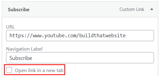
Open in a new window
Go to Appearance > Menus then open the screen options drop-down (top-right corner). Click to enable the ‘Link Target’ option if it isn’t already checked.
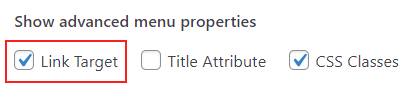
Now when adding a custom link to your menu, you’ll have the option to ‘Open in a new Tab’.
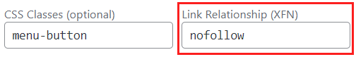
Add link rel=”nofollow” (or sponsored)
The rel=”nofollow” and newer rel=”sponsored” are essential tools for your site’s on-page SEO strategy.
They allow you to tell Google which external links shouldn’t pass link juice, such as affiliate links. This helps you keep your page-rank on your own pages, and stay in Google’s good graces by nofollowing sponsored/paid links.
Steps to nofollow a menu link
- In screen options, make sure ‘Link Relationship (XFN)’ is checked
- Go to the menu item you want, and enter ‘nofollow’ (no quotes) in the Link Relationship field.
It didn’t work. Are we to delete (or replace) the lines starting with the asterisks?
.menu-button a {
border: 3px solid red; /* button border width and color */
color: red; /* text color */
line-height: initial; /* reset the line-height. Let padding control size */
padding: 10px 20px;
border-radius: 5px;
font-size: 19px; /* Optional. Remove to match to your other menu items */
transition: all .25s; /* animate the hover transition. Duration 0.25 seconds */
}
.menu-button a:hover {
color: white; /* change the hover text color */
background-color: red; /* fill the background on hover */
}
Everything between the /* and */ characters is a CSS comment. It’s meant to explain what the code does, but it should still work properly if you leave them in.